The Center widget in Flutter is a simple yet powerful widget that centers its child within the available space. It's often used to position a widget in the middle of its parent widget.
Key Features of Center
- Alignment: The
Centerwidget by default centers its child both horizontally and vertically. - Constraints: The child of a
Centerwidget is allowed to have any size it wants unless constrained by its parent. - Ease of Use: The
Centerwidget is commonly used because of its simplicity and readability when designing UI.Parameters
child:- The widget that you want to center.
- If
null, theCenterwidget will occupy all available space but won't display anything.
widthFactorandheightFactor:- Multipliers for the size of the child.
- These are optional parameters. If specified, the width and/or height of the
Centerwidget will be the child’s size multiplied by the respective factor. - If
null, theCenterwill expand to fit its parent.
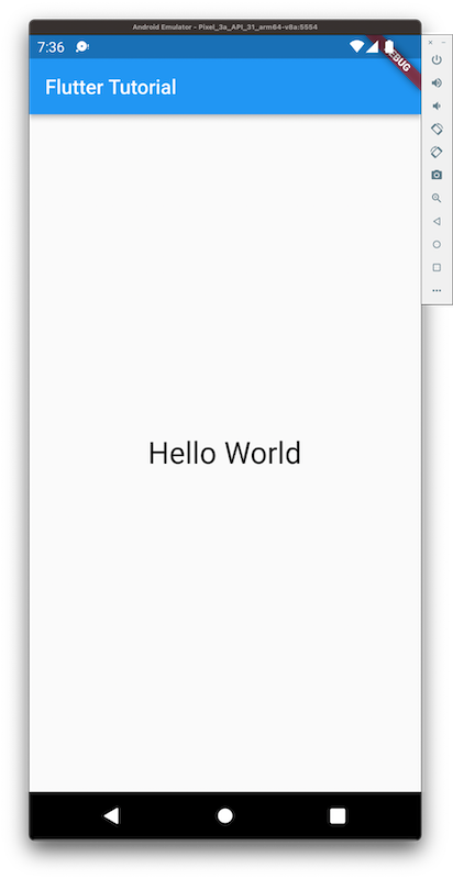
Basic Example
Output: The text Hello, Flutter! will be centered on the screen.
Example with
widthFactorandheightFactorIn this case:
- The blue container's size is 50x50.
- The
Centerwidget's size will be 2 times the width and height of the container (i.e., 100x100).
Why Use
Center?- Quick and Clean: It eliminates the need for complex positioning logic for centralizing widgets.
- Common in UIs: Many designs require elements to be centered, making
Centera go-to widget.
Alternatives
Align: UseAlignif you need more control over the positioning, like aligning to a specific edge or corner.PaddingorContainer: These can also be used in conjunction withalignmentfor similar effects.
The
Centerwidget is a fundamental building block in Flutter that simplifies centering tasks.
Comments
Post a Comment